Product Design
CABOCA — Sustainability
Support for Better Eating
Tools
Illustrator, Indesign,
Lightroom, Photoshop, Figma
Time
24 weeks 2020
Tasks
Research, Ideation, Visual Design & Branding, Illustration, Type setting, Wireframing, prototyping, User Testing.

Introduction
We asked: Can consumers be empowered to make more sustainable food purchasing decisions?
Yes they can! Caboca, a community based, crowd-sourced food identification tool is a springboard into making those eco-conscious choices easy!

The Problem
Not Enough Time, & Not enough Clarity
Let’s face it, finding time to hunker down and learn about the food we eat is not something we all have time for. And when we do go out of our way to learn a bit about a particular food item, we end up down a rabbit hole with no end in sight! To make matters worse, it seems as if the only way to make sustainable choices is to shell out for it.
The Solution
Condense It & Work Together!
By defining the main factors of sustainability, and providing that information on items in a condensed and clear manner we make learning about the foods you eat fast and simple.
And by providing the community a platform to share their local food choices, others can improve their own choices.

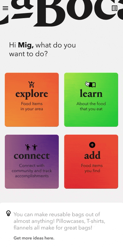
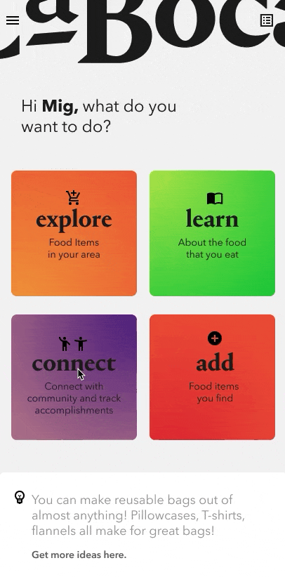
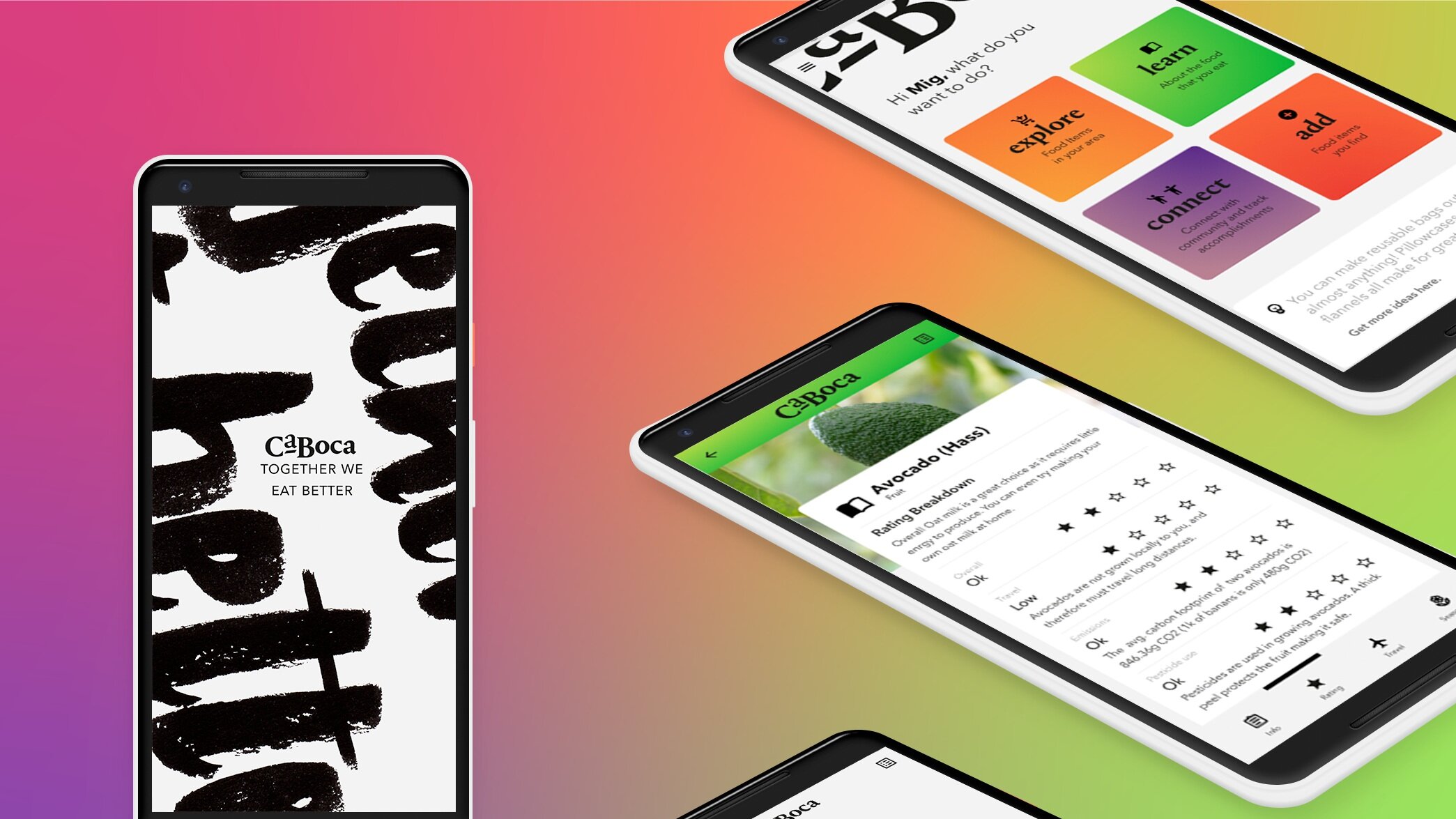
Usage
Explore, Learn, Connect, & Add…
Search for food items, learn about it, and then find options locally, or enlist others to help. Caboca provides you with a condensed look at the key sustainability factors. Reducing the amount of research time needed to make a decision you can feel good about.
Learn
About the food you eat
The database provides you with what you need to make an informed purchase. Learn about the process of how it is grown, when it’s in season, whether it requires pesticides to grow, and the energy required for it to be stored or shipped to you.

Explore
The many places
Find items you are looking for locally, that meet your needs. Food items at grocery stores, co-ops, markets, and even your local growers.


Connect
With others
To hear about new products, seasonal markets, and local food producers. Or simply enlist the help of others to help find that product you’ve been looking for.

Add
The items you
find in store.
If you come accross a product that you think others might like to know about, snap a pic, tell us a little about it, and share! Help others make more sustainable choices by sharing the ones you make!

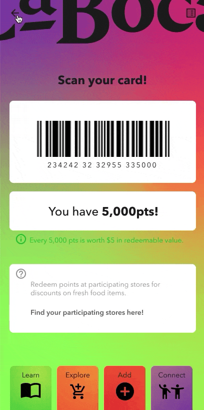
Extras
Track your choices & get points!
Earn points when you interact with Caboca and share the items you find. These points can then be used at participating markets. Markets that choose to participate can do so in in order to help build stronger customer bases.


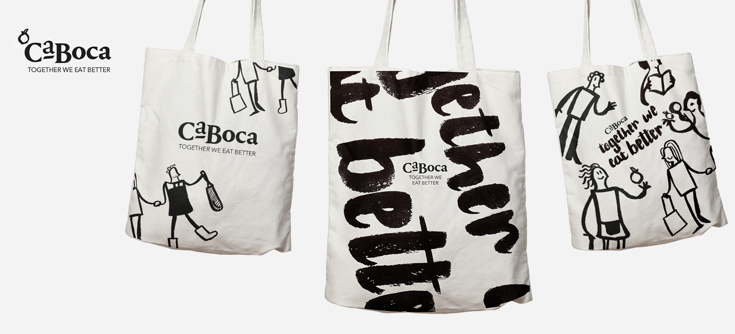
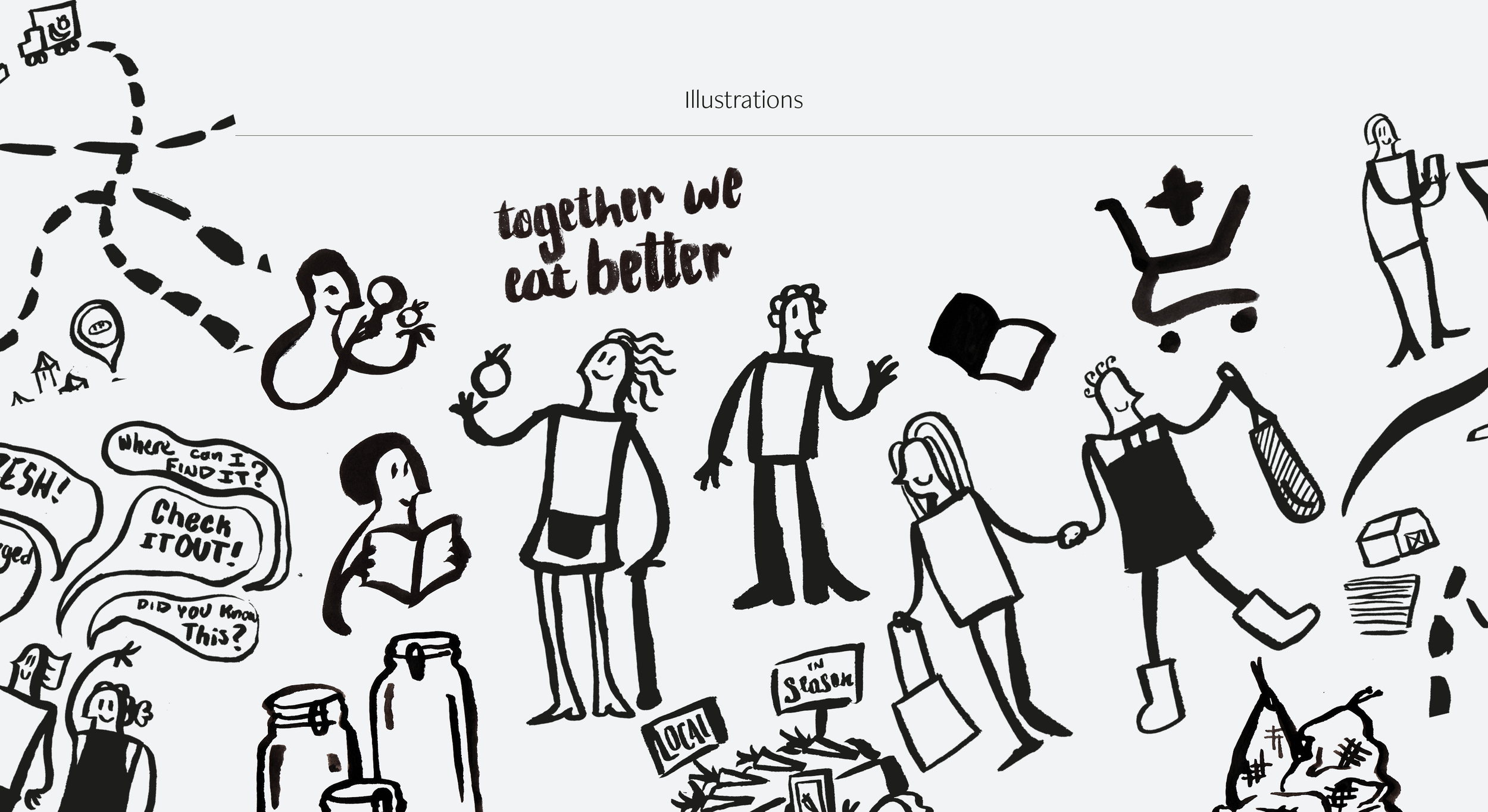
Visual Design & Branding
Joyful Contemporary
Designed to be joyful and welcoming, Caboca is a brand for everyone. Design choices were made to foster a positive and engaging environment. Some of these choices include simplistic illustrations that aid in the communication of the tool’s functions. The primary font choice here is Avenir Next Cyrillic. A geometric sans, with improved legibility features make it best suited for the purposes of digital legibility. The logotype and headers are set in Portrait, a humanist architectural typeface with a playful demeanor.
Behind the Design…
Discovery Phase
In order to better understand shopping behaviour of regular people I conducted a questionair and interview. Thematic analysis of this research lead to three key needs that would be important to consider in the building of the app. These were: to have a better in depth understanding of where food comes from, Affordability, and ease of learning this information.
Once these needs were undesrtood I looked at what competitors may exist for what I planned on building. It was important to decipher the strengths and weaknesses of this tools and how users were currently using them.
Process & Development Phase
To better define the needs of individuals who might use this tool,
I created user personas and user scenarios to consider possible use cases. With these scenarios I was able to better define what may be necessary in including in the tools layout, and how that should be ordered.
Other methods used to define the functions of this tool were to consider possible functions, and organising them using the ‘MoSCoW’ method.
Prototype & Layout Phase
lo-fi wireframes, architecture mapping and branding was developed at this stage.
Once these were completed content creation began and the lo-fi wireframes were populated and updated with the branding style.